It occurred to me last night, that there must be a way to search within Google’s archive of results, words / phrases and their use over time – frequency of occurrence down to when it first entered the record. While I didn’t find exactly what I wanted, I found the Google Ngram Viewer.
My morbid preoccupation with the existential abyss that is life on earth and penchant for apocalyptic thinking in general, I endeavored to see what patterns if any we could glean from the archive.
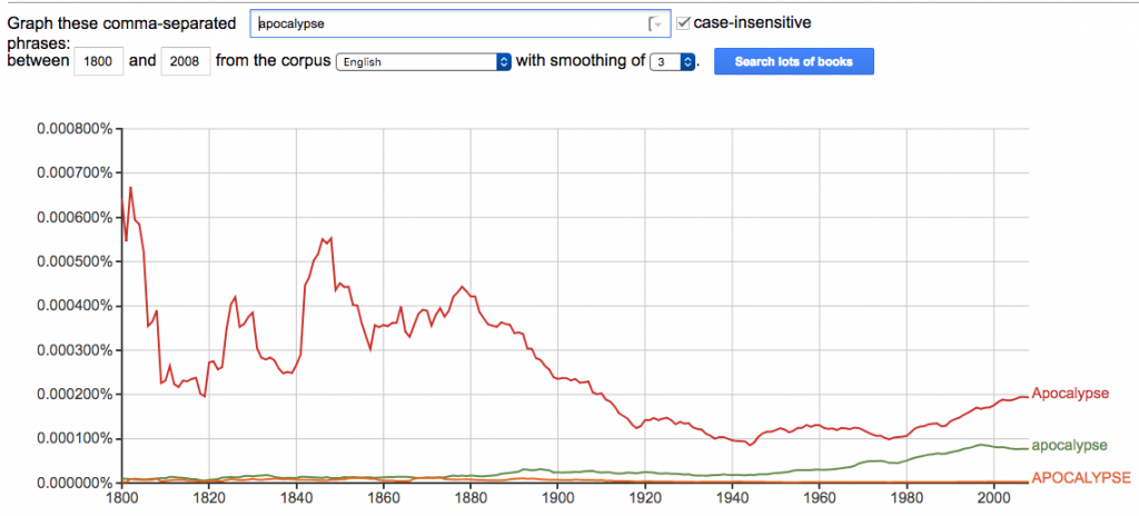
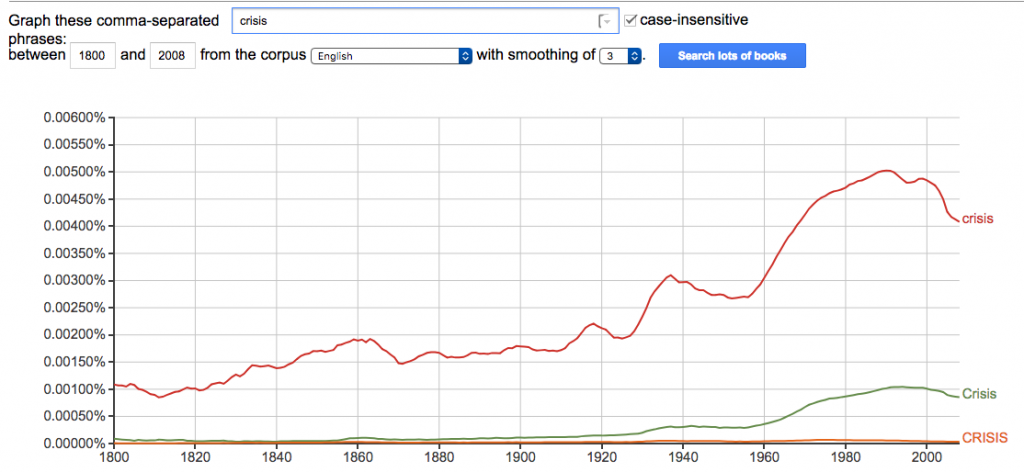
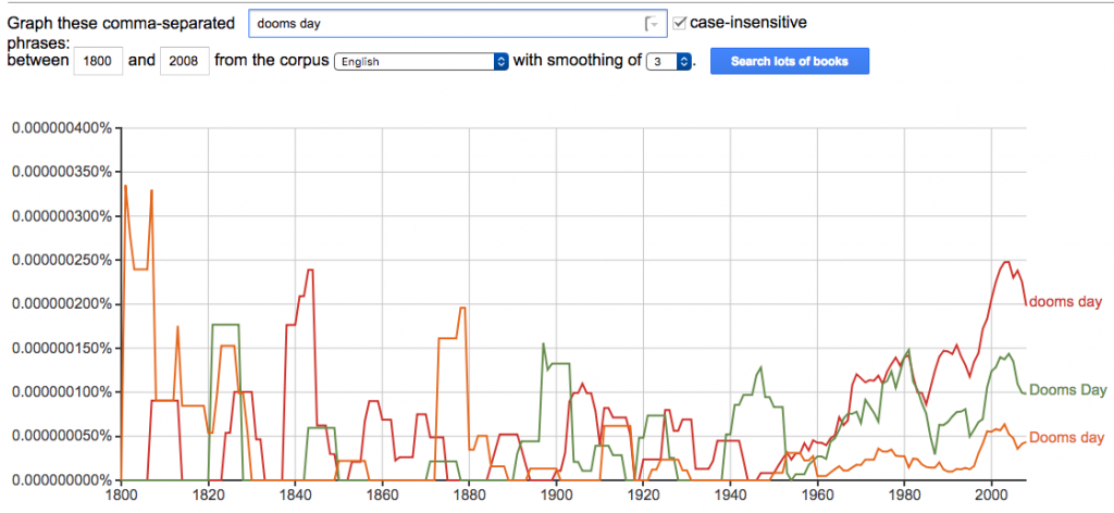
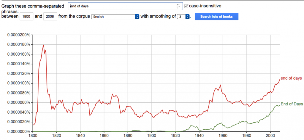
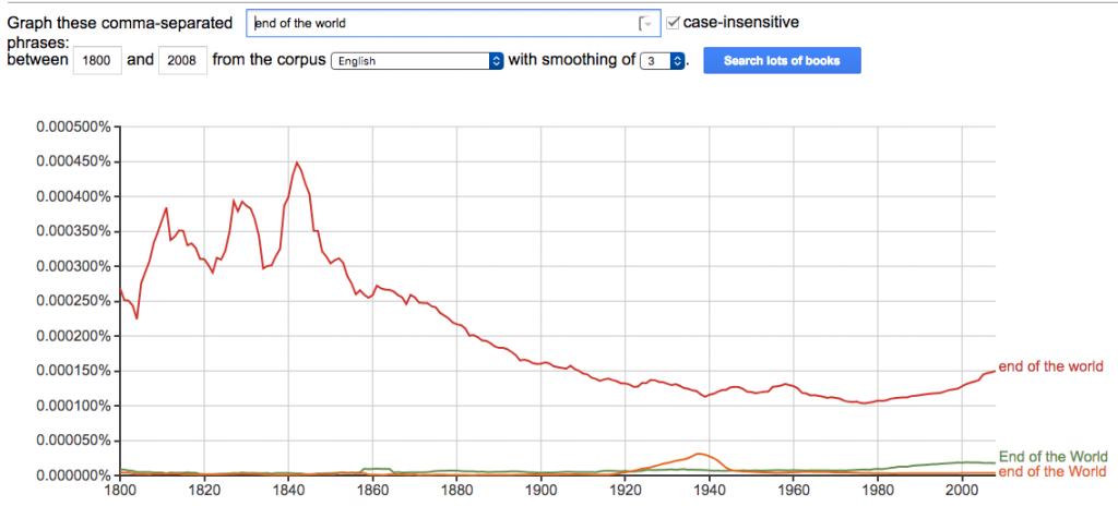
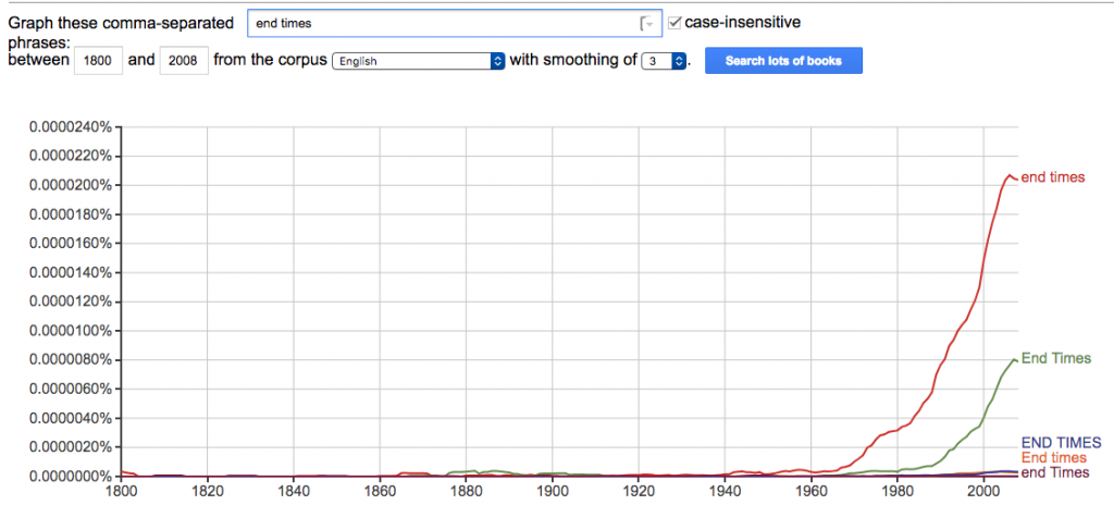
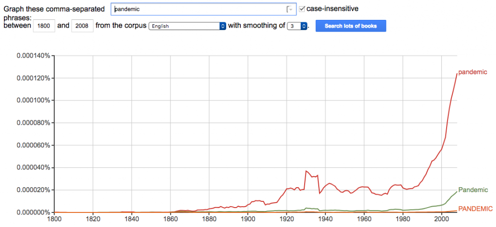
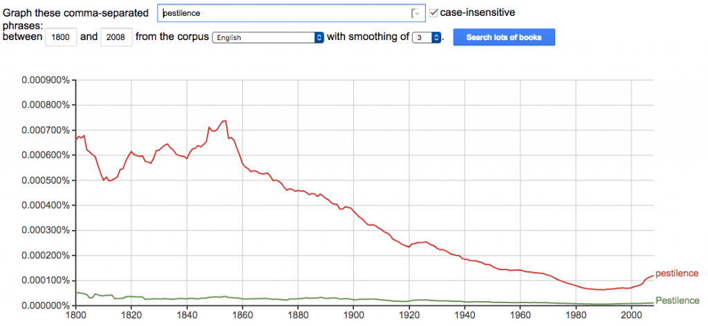
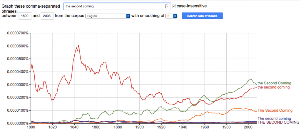
GRAPHS
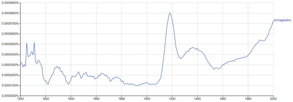
late entry…how could I have forgotten Armageddon??
Impressions
This dumb experiment turned out to be super interesting. I’d originally wanted to search for references to the so called Opioid Crisis, and dig into how Pharma was marketing to doctors as the new crop of opioids were being developed.
In broads strokes, the whole 19th century seemed pretty fuuuuuucked up. Things started to chill out in the early 20th century. Now on the eve of the 21st century there is slow but steady increase in hysteria around the end of the world. The WWI spike in the Armageddon chart is dope.
Granted, this is far from a scientific study – obviously certain words and their usage have their moments based on a multitude of influences [for instance my word choice is obviously indicative of a particular Christian upbringing] but it is interesting to think about.
The “Dooms Day” chart is by far the most interesting. It ebbs and flows, like clockwork every 10 years or so…
more to come….
Comments are closed.